
Zaru takes advantage of the latest graphics hardware and leverages tricks for data organization (invented at Sasaki) to streamline navigation, querying and representation of massive data sets.
Zaru currently works best with raster data, polygons with aggregate data and point records. It is at a proof-of-concept stage and is being further developed as use cases arise at Sasaki. All geospatial data is converted into data tiles for rapid visualization. Learn more about our data tile format at geo-png-db
If you are interested to know more or have a specific use case in mind, please contact us via GitHub.

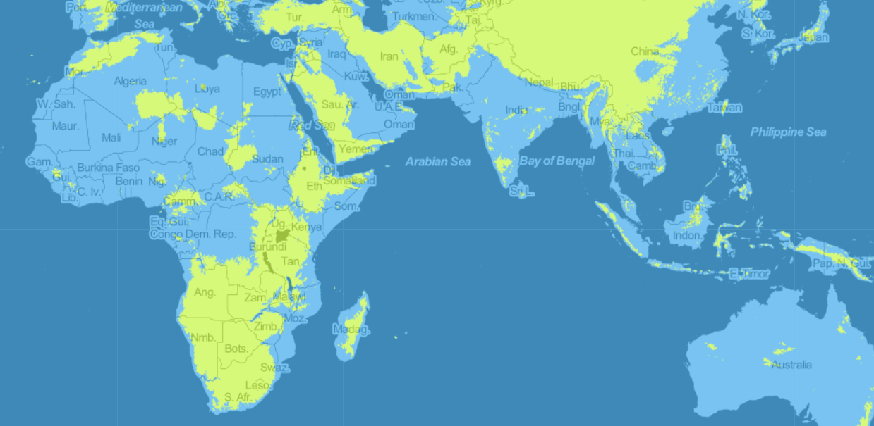
This simple demonstration of Zaru's scalability shows how a massive raster grid dataset can be loaded and queried in real-time. MapZen generated this dataset which includes over 70 trillion (70,368,744,000,000) data points for elevations across the globe. It is interesting to use filtering rather than gradient ramps as a way to inspect characteristics of world topography.
View Example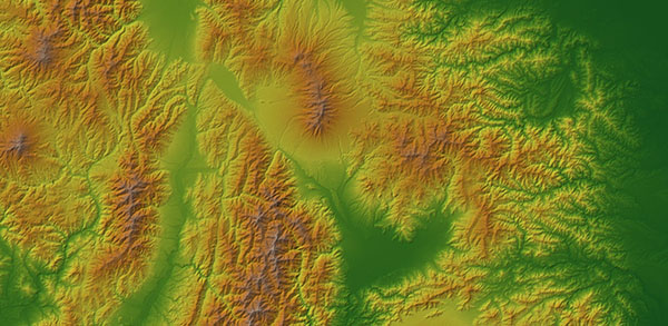
This is a more sophisticated demonstration of the global terrain tiles data. It includes the ability to apply color ramps and even hill-shading in real-time. Try zooming in and adjusting the settings to tease out interesting characteristics of the terrain.
View ExampleRaster information is stored as a grid of cells. Rasters are well suited to aggregate data (such as census data from polygons), and global surface data sets (e.g. soils / terrain).
In Zaru, multiple layers can be combined & filtering and classifications (coloring) can be performed in real-time. Because data is organized into pyramid tiles using a conventional web schema, we can instantly load and analyze datasets of practically unlimited size. We can also look at relationships between multiple datasets in real-time.
The MapZen Terrain data tiles are so far the only global data set we've found to demonstrate this data scale. We are planning to process additional data tiles for world population, US census data and world soil data.
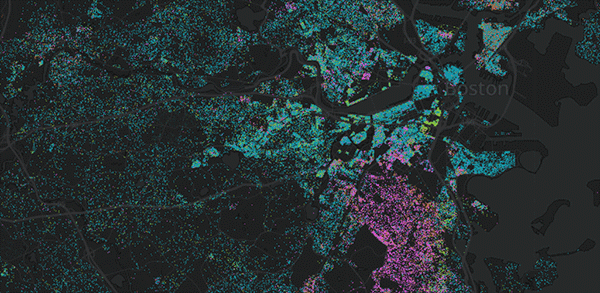
This example shows a population dot density race map for Boston. Typical dot density maps represent data as points, but Zaru keeps a numeric count on each pixel. The actual dot display is calculated as the final step in rendering it on the screen. This gives us the ability to manipulate the dots in real-time. We can query the data, combine it with other layers, and also adjust the dot density and coloring on-the-fly. In this example you can filter the dots by median income of the census block group.
View Example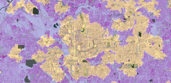
An example of how multiple datasets can be combined in real-time to reveal insights about access. Here we load a number of grid-based datasets for Atlanta - one for population, another for neighborhood areas & one for walk times to all amenities of a certain type (amenity data from OpenStreetMap). This technique allows us to quickly see the population who are not being served by each amenity type.
Atlanta ExampleA more sophisticated version of was developed as part of Sasaki's Parks and Equity research. It lets us inspect characteristics of the populations who are served and not served and also factors in quality of amenities and different modes of access.
LA County ExampleDot density maps provide a handy way to visualize both distribution and mix in the same diagram. A popular use case is to illustrate population distribution for different race groups. However any distribution mix can be shown as dot-density. Good candidates might be locations of jobs - or distribution of office space by type.
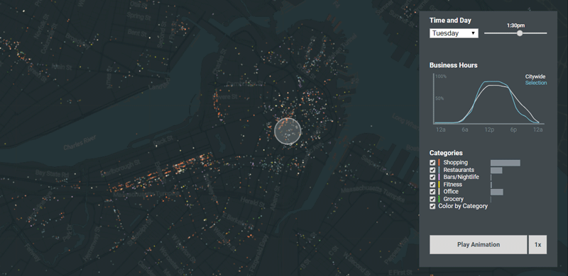
This visualization forms part of Brad Barnett's We're Open Data Story based off Yelp data. We needed a way to create a video-like animation across the course of a week while still maintaining user interactions for exploring data. Although the scale of the data is a modest 10,000 records, we hit the limits of existing tools and turned to Zaru for a smooth experience (even on mobile). Try inspecting records while the animation plays.
View Example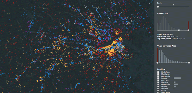
We chose the MA State Parcels dataset in order to test the scalability of the point system. While raster data is effectively unlimited in Zaru, point records have some limits. This dataset performs admirably filtering and coloring the 2.5 million parcels in MA. Try grabbing the middle of the histogram sliders to see values filter across the state.
View Example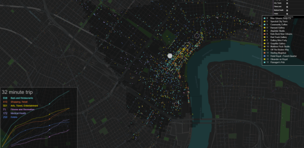
An example of how point and grid datasets can be combined in real-time to reveal insights about access. The point records shown here come from Facebook/Instagram Places database. As the transit isochrones expand we can examine the businesses that can be reached at different times.
View ExamplePoint Data is used to represent individual records with multiple properties anywhere on a map. Our approach to representing point data is optimized for efficient querying and display. It is well suited for exploring data relationships as well as animation and storytelling.
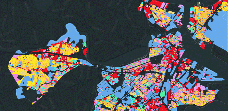
A visualization of all parcels in Boston. Filters can be applied based on year built. Note the graphic treatment of parcels when zoomed out. This system overcomes the typical layering bias inherent in vector based systems and instead uses a probabilistic assignment to determine pixel colors. The result can be graphically busy, but is less misleading in terms of data clarity.
View ExamplePolygon data (such as census block data) is typically converted to raster to be used in Zaru. However when record level access and filtering is needed, we are able to store and access polygons with this system. Because this solution is a little more complex to implement, we will focus on the simpler approaches (Points and Rasters) unless a compelling use case arises.